Israpps


The process
The main focus of this redesign was making the app feel more native to the OS and highlighting the app's main action: Buying a ticket.
The hamburger menu was too broad and many actions appeared more than once with no purpose.
By dividing everything into 3 tabs, everything is easier to find. Specially booking a flight.


The process
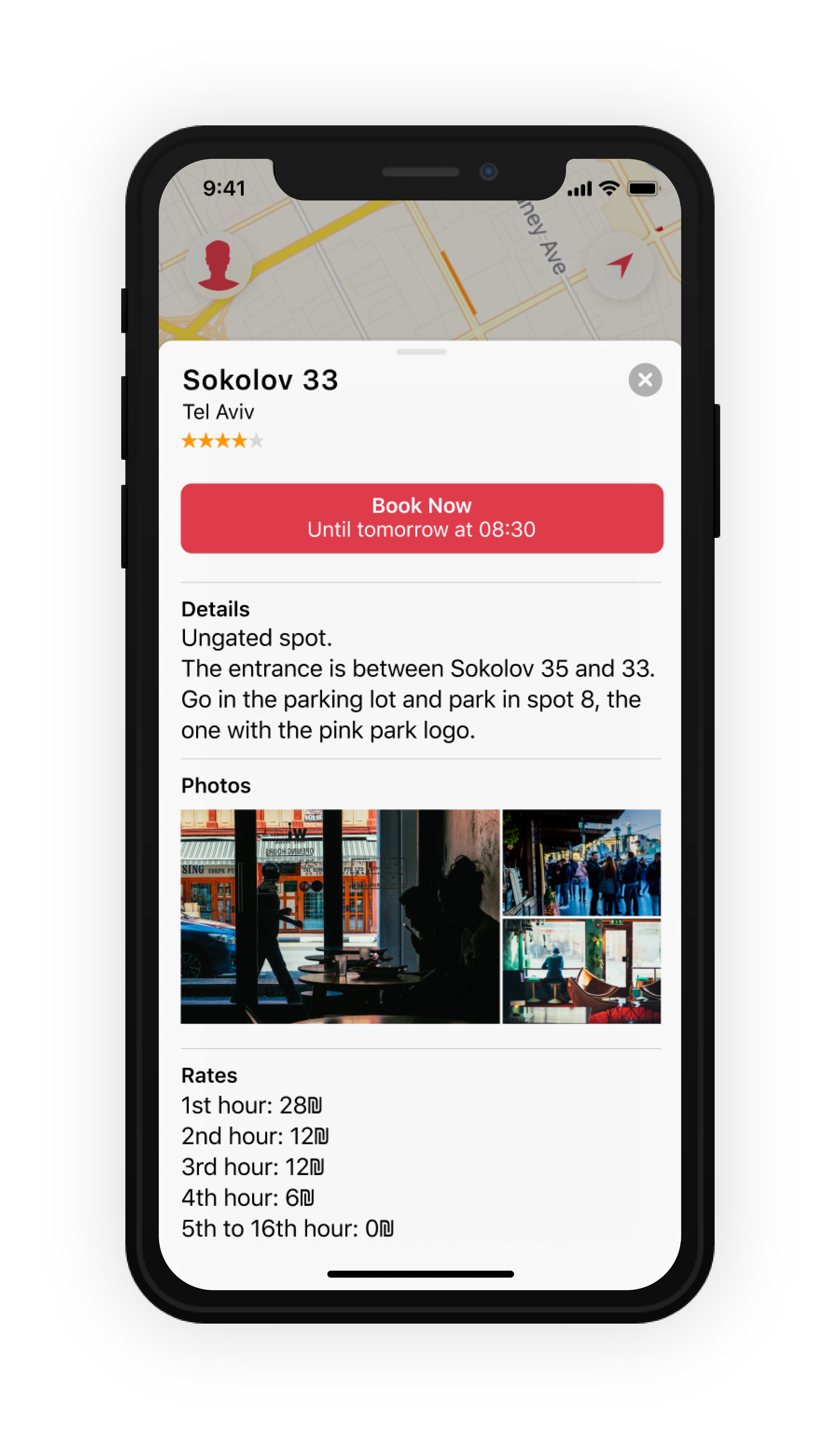
When redesigning this app the first thing in mind was taking advantage of the screen. Not only by updating the app to the new dimensions, but by giving the map the space it requires to be used comfortably.
The next thing was to make the whole app feel more native, specially when opening one of the listings. What better way to do it in these new big screens than to use the card interface?


The process
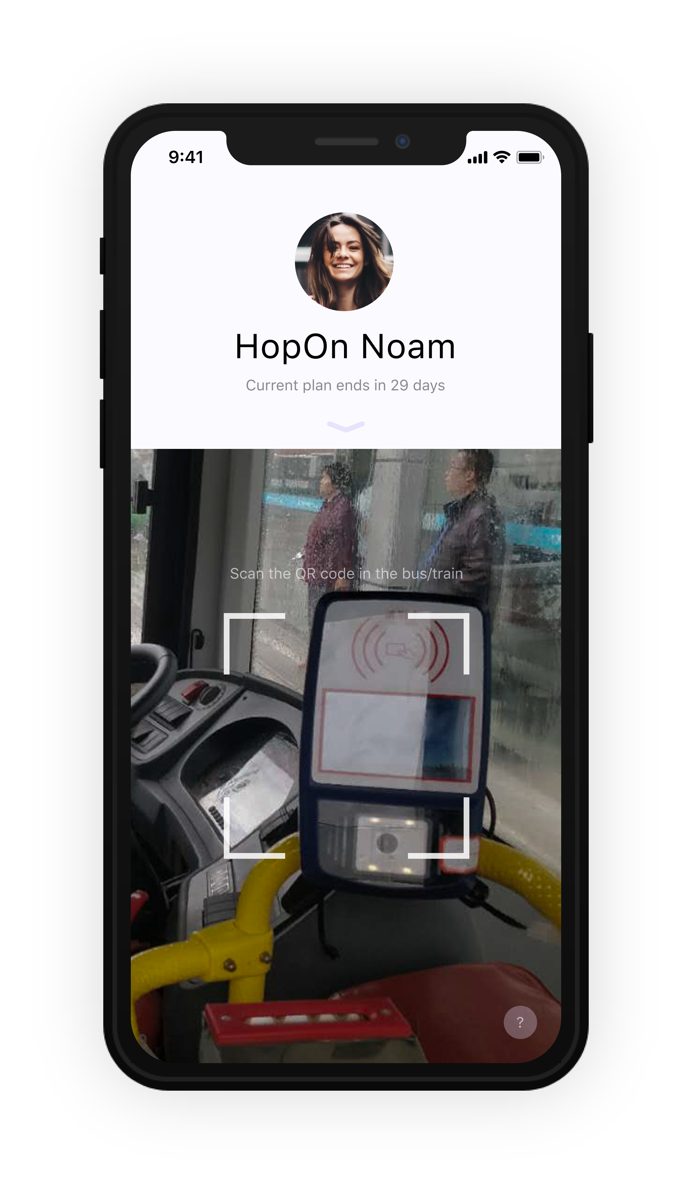
When redesigning this app the first thing was to bring it all the way from 2013.
The whole UI was redone from the ground up to highlight the main action: Scanning QR codes.
Since the way of using the app changed so much and this app is meant to be used by everybody, it's only fitting to have self explanatory menus and easy access to a tutorial from the main screen.

